How to Color Match a Product Image: A Complete Guide
Do you ever look at a product image online and wonder, “Is that the actual color?” As someone who has worked in product photography for years, I’ve seen how uneven colors can confuse customers and hurt sales. Learning how to color match a product photo can save you from these issues. Whether you’re a photographer, designer, or eCommerce store owner, Perfect color matching ensures your product images look professional and real.
In this blog, we’ll explain how to color match images e-commerce photo retoucher, why it’s crucial, and how you can do it in Photoshop step-by-step. Let’s get started!
What Is Color Matching?
Color matching in e-commerce means making sure the colors in product photos match the real product. When Shoppers shop online, they rely on photos to see what they’re buying. If the color looks different in the photo, it can lead to confusion or returns. Good color matching ensures that what the customer sees is exactly what they get. This builds trust and helps users feel confident in their buying. It’s all about using the right lighting and editing to get the colors just right and give clients a true view of the product.
For example, At Sr clipping we once worked with a clothing brand that Fought to sell a popular red dress because the photos made it look orange. Once we fixed the color, sales went up by 30% within a week!
Why It Matters:
- Builds Trust: Customers expect the product they receive to match the image they saw online.
- Reduces Returns: Incorrect colors are one of the top causes of product returns.
- Enhances Brand Reputation: Professional-looking images make your brand look more reliable.
Why Is Color Matching Difficult?
There are top five reasons why getting the colors right in a product image can be tricky
- Lighting Variations: Natural light, studio light, and even light bulbs can affect how colors appear.
- Camera Settings: Every camera processes colors differently.
- Screen Differences: A color might look perfect on your computer but appear too bright or dull on someone else’s screen.
- Material Reflectivity: Shiny or textured surfaces reflect light in unique ways, making color correction harder.
- Environmental Factors: Background colors and nearby objects can also affect how the product color appears.
Tools You Need for Color Matching
Here are the best tools at SR Clipping we use and recommend for perfect color matching:
- Color Cards: A color card (like an X-Rite ColorChecker) ensures you have a reference point for correcting colors.
- Photo Editing Software: Adobe Photoshop or Lightroom works wonders for fine-tuning colors.
- Calibrated Monitor: An uncalibrated monitor might mislead you about the accuracy of your colors.
- Lighting Equipment: Consistent lighting minimizes color inconsistencies during the shoot.
- Camera Settings: Shooting in RAW format and using the correct color profile enhances your editing flexibility.
Want to know how big is 4*6 photo?
Step-by-Step Guide to Color Match eCommerce Product Images In Photoshop
Here’s a beginner-friendly, step-by-step process to color match using Adobe Photoshop:
#1. Open Your Image:
- Press Ctrl + O (Windows) or Cmd + O (Mac) to open your product image in Photoshop.
#2. Add the Color Card Reference:
Place a color card in your frame next to the product before you start shooting. This card provides a reference point that helps you adjust the colors during editing. A simple investment in a good color card can save hours of editing time later.
- Use the Crop Tool (C) to ensure the color card is visible in the image frame. The color card should remain in the editing stage for accuracy.
#3. Set White Balance:
White balance affects how warm or cool your product image looks. Use your editing software to set the correct white balance based on the color card. This is more than important if you’re photographing in mixed lighting conditions.
- Select the Eyedropper Tool (I) and click on the gray square in the color card to adjust the white balance. This will set a neutral base for your colors.
#4. Adjust Levels:
If your monitor isn’t Adjusted, you might be seeing inaccurate colors. Use a tool like Datacolor SpyderX to Adjust your screen. Without Adjusting you’re essentially guessing the final color
- output.Press Ctrl + L (Windows) or Cmd + L (Mac) to open the Levels adjustment.
- Adjust the black, gray, and white sliders to match the reference points on your color card.
- Ensure no color clipping by observing the histogram.
#5. Fine-Tune Colors:
- Go to Image > Adjustments > Hue/Saturation or press Ctrl + U (Windows) / Cmd + U (Mac).
- Use the Hue slider to shift colors to the right tone, Saturation to control intensity, and Lightness to adjust brightness.
#6. Remove Unwanted Tints:
- Add a Selective Color adjustment layer from the Layers panel.
- Adjust specific color ranges (e.g., reds, yellows) to ensure your product matches its real-life appearance.
#7. Check Color Consistency:
- Zoom in (Ctrl + +) to inspect small details like edges, highlights, and shadows.
- Use the Color Sampler Tool to measure and compare specific areas for consistency.
#8. Save Your Image:
- Press Ctrl + Shift + S (Windows) or Cmd + Shift + S (Mac) to save the edited image in a high-quality format like PNG or TIFF. Avoid compressing to maintain color fidelity.
Before finalizing, check how the image looks on different screens. A color that looks perfect on your monitor might appear too bright on a phone. Testing ensures consistency
Common Mistakes to Avoid
When color matching product images, it’s easy to make mistakes. Avoid these pitfalls:
- Overediting: Over-saturating colors might make the image pop, but it can also look unrealistic.
- Ignoring Monitor Calibration: Without a calibrated monitor, your edits might not look right on other screens.
- Skipping Lighting Setup: Poor lighting makes color correction much harder.
- Forgetting to Use RAW Format: JPEGs have limited data, which can restrict color corrections.
- Relying Only on Memory: Always keep the product nearby for accurate comparison.
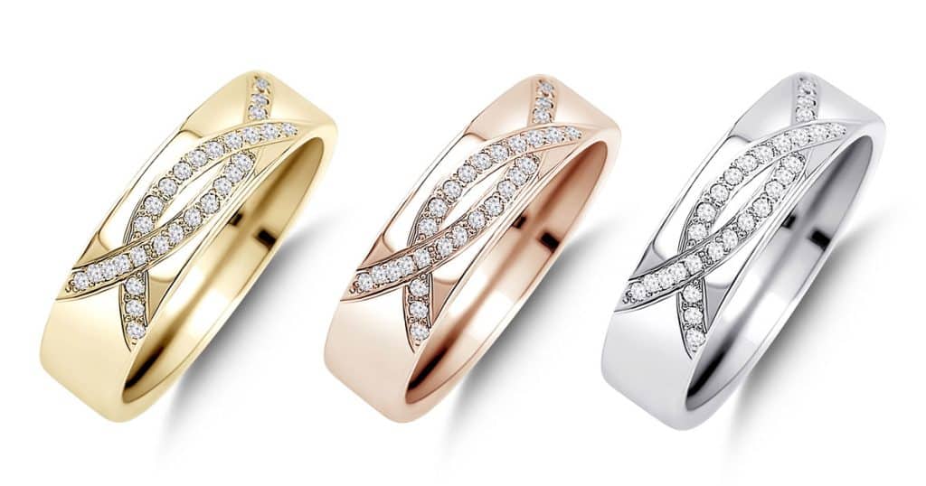
At Sr Clipping Ltd Our Real-Life Example
Let us share a quick story. An American friend of mine runs a jewelry store and was struggling with online sales because her product photos didn’t show the true sparkle and color of her pieces. After we helped her use a color card and calibrate her monitor, her jewelry photos looked stunning. Her sales increased by 50% in just two months!
Another example comes from our experience with a furniture brand. Their wooden tables often looked too yellow or too dull in photos. By setting up consistent lighting and editing with precise tools, we nailed the natural tones, and customer inquiries doubled within a few weeks.
Tips for Perfect Color Matching
- Shoot in RAW Format: RAW files capture more color data, giving you more flexibility during editing.
- Test on Multiple Devices: Always view your images on different screens to check for consistency.
- Keep the Original Product Nearby: This helps you compare the image with the real product.
- Use Natural Light: When possible, natural light creates the most accurate color representation.
- Zoom In for Details: Small color details can make or break the overall match.
- Consistency is Key: Always use the same tools and setup to maintain a uniform style across images.
Additional Proven Techniques to Enhance Color Accuracy
- Custom Camera Profiles: Many professional cameras allow you to create custom profiles for specific lighting conditions, making color correction easier.
- Histogram Analysis: Use the histogram in your editing software to ensure colors are balanced and not overly bright or dark.
- Selective Color Adjustments: Tweak individual colors (e.g., red, blue) to match the product’s real-life appearance.
- Color Grading Presets: Save presets for commonly used settings to speed up future edits
Conclusion
Color matching a product image might sound some complex, but with the right tools and the right process, anyone can do it. Perfect color matching improves customer trust, reduces returns, and boosts sales. Start small, invest in the basics, and practice regularly.